Allwyn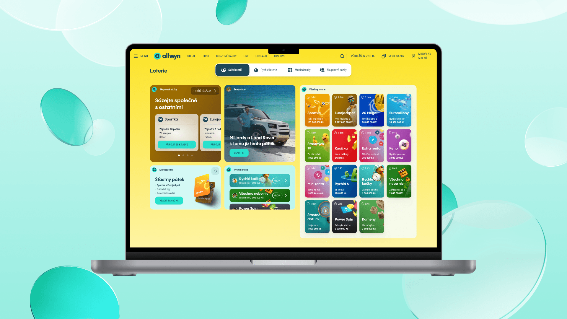
How we switched Sazka to Allwyn 50 % faster
For years Sazka was one of the best-known Czech brands. Turning it into Allwyn took more than swapping a logo and colours. The new identity had to show up across websites, apps, gaming environments and the hundreds of screens people use every day.
And the products kept running the whole time. Releases continued, development shipped new requirements, and for a while two versions of the brand had to coexist. Thanks to the Molekula design system we helped keep the change under control, speed the work up by as much as 50 % and cut design, development and rollout costs by 30–40 %.
The scope was far from small. The rebrand touched more than 650 design tokens, roughly 1,000 components and 600 existing and new assets — which propagate, directly or indirectly, into many hundreds of screens across every digital touchpoint.
The brand changed. The products kept running
Since January 2026 Sazka operates as Allwyn. The games stayed the same, but the whole brand framework changed: colours, typography, icons, components, forms and modal windows.
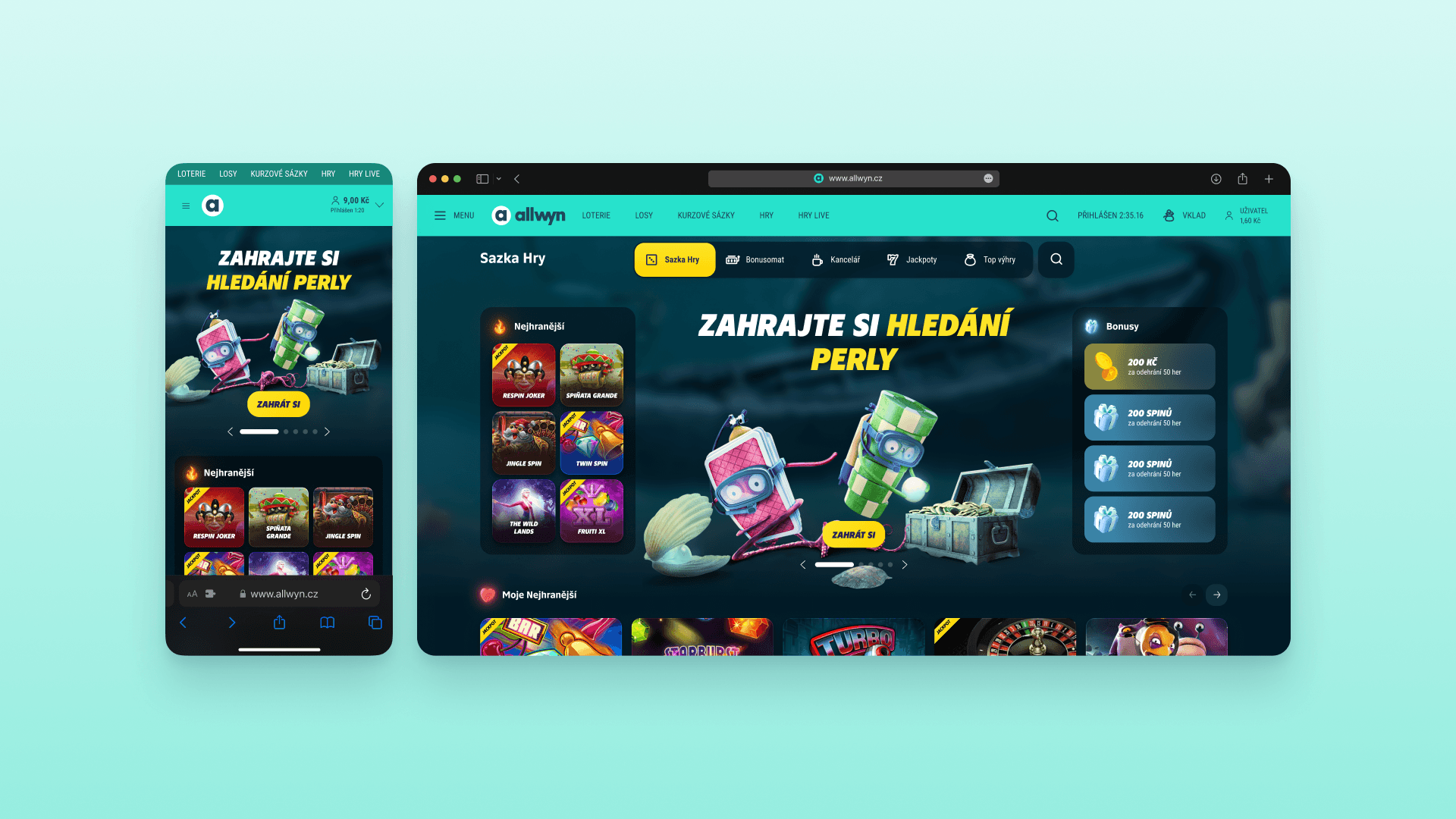
Users don’t meet the new brand only in a campaign or on the homepage. They see it in every button, screen, icon and notification. These are the details that decide whether a digital product feels clear, trustworthy and consistent.
At the same time it had to build on the original Sazka. People had known it for years by its distinctive yellow, so Allwyn kept it in part as a recognition cue. Nothing needed to be cut off entirely — the familiar Sazka world just had to be cleverly connected to the new Allwyn identity.
Molekula held the change together
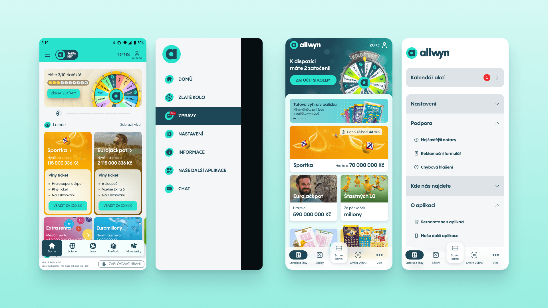
We’ve been building the design system with Sazka for a long time. It’s exactly why the rebrand didn’t have to mean hundreds of separate interventions across websites, apps and gaming environments.
Moments like this are where the strength of a continuously-built design system really shows. When the rebrand came, a large part of the necessary work was already done and ready in Molekula.
We handled the changes at the level of core building blocks: colours, typography, icons and usage rules. Once the system was updated, the new visual style could propagate into components and screens faster and more consistently.
Instead of manually reworking many hundreds of screens, it was enough to change a few values in the libraries. That also lowered the risk of an old colour, wrong typeface or badly assembled component surviving somewhere.
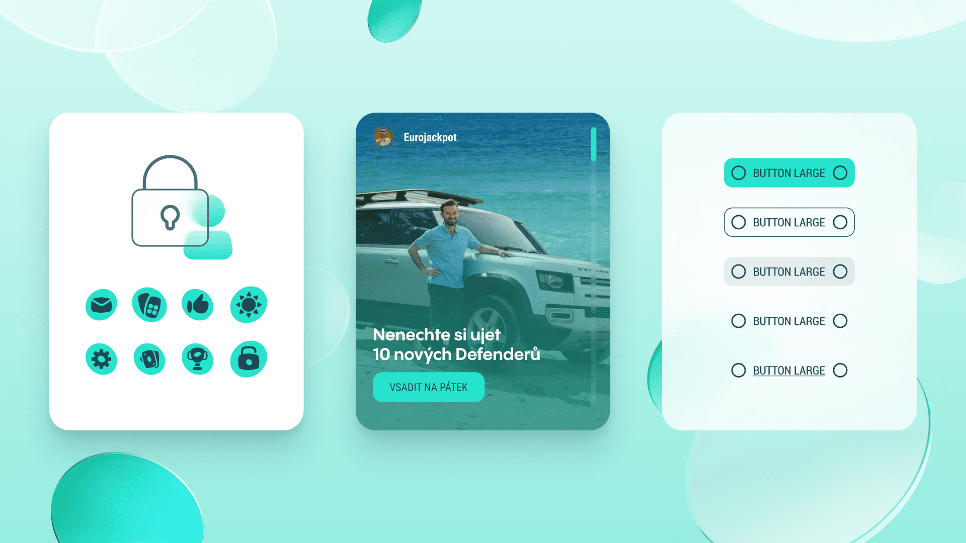
Not everything could just be recoloured. The new brand had to be worked out for the digital environment and its general brand-manual rules translated into concrete product situations. The change also helped unify older templates and outputs that were no longer tied to the current design system. The result was a solid framework for design, development and rollout alike.
A year with two versions of the brand
The rebrand wasn’t one big overnight switch. For about a year two versions of the brand had to run side by side: the original Sazka and the new Allwyn.
That’s exactly the phase where projects like this often get complicated. Some things already belong to the new world. Some still have to stay in the old one. On top of that: releases, new requirements, output reviews and development prep.
And product development couldn’t stop. So the rebrand ran in parallel with it, not at its expense.
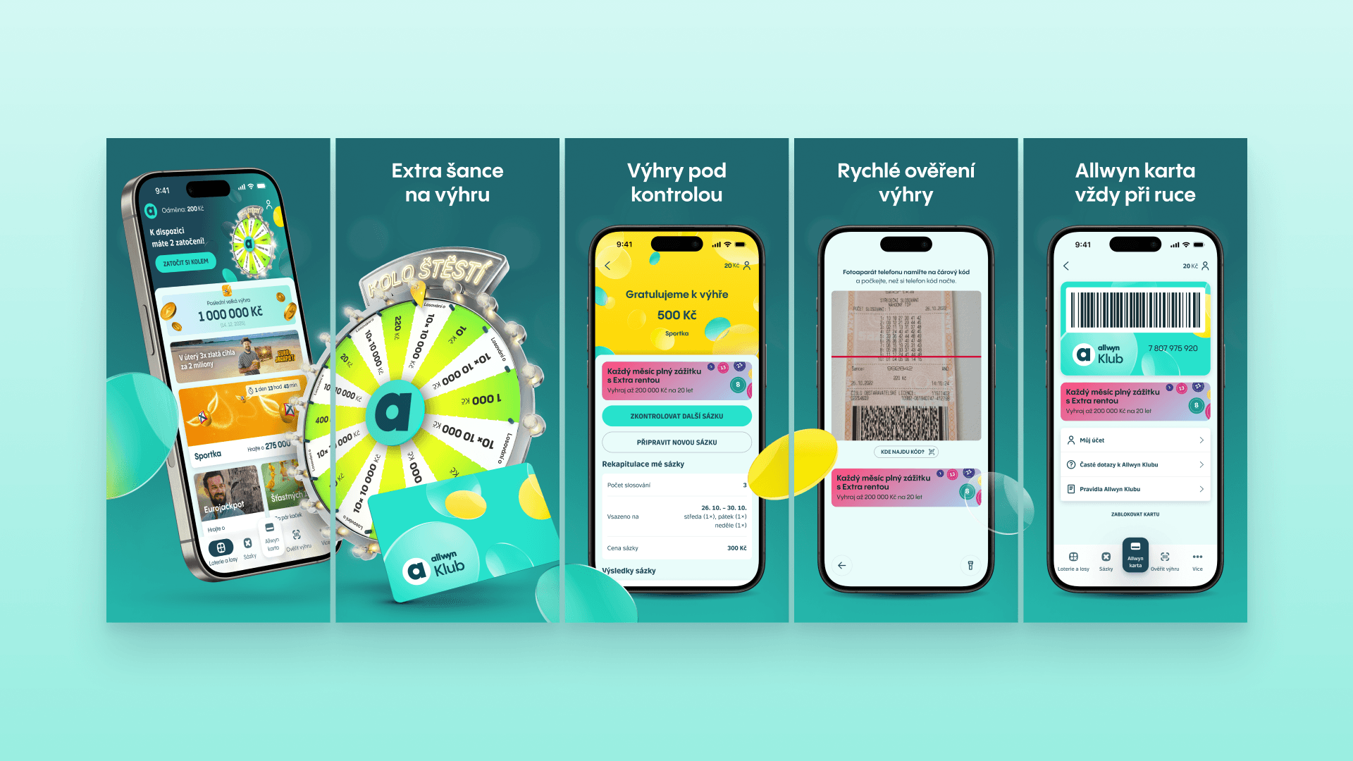
So in Figma we set up parallel visual modes for the original Sazka, Sazka games and the new Allwyn. A finished screen could be shown quickly in its new form to verify how the brand behaves in a real product.
The client didn’t just see abstract rules in a brand manual. They saw the concrete impact on screens people actually use. And for the team it mostly meant certainty. It was clear what was changing, where, and what still stayed in the original Sazka style.
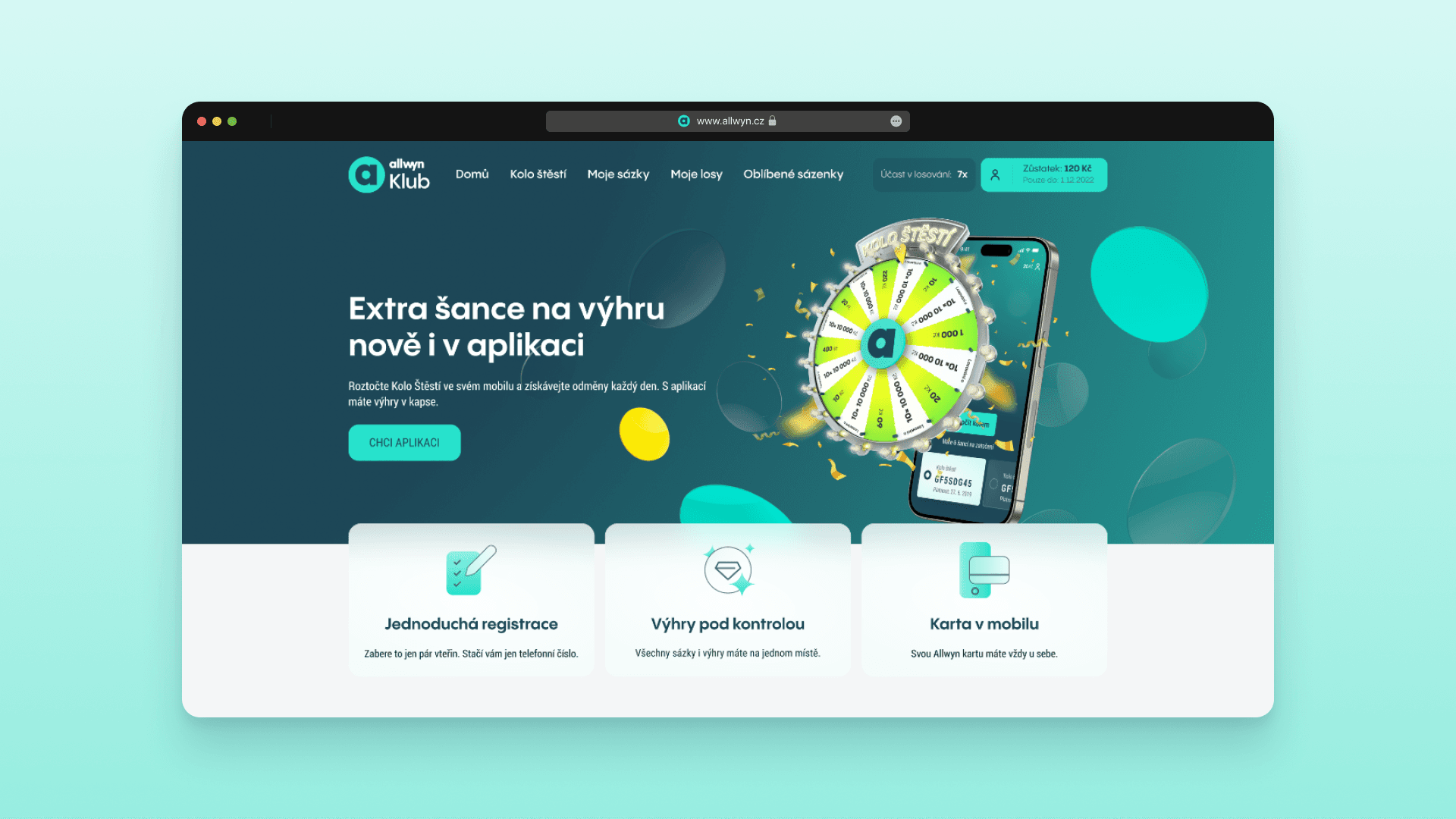
That same certainty mattered at launch. The switch happened without crisis fixes, broken forms or spots left in the old colour or typography. From day one the website, app, gaming environment and loyalty programme all spoke the same visual language.
A change that saved time and money
Thanks to the design system, the visual-identity change was handled up to 50 % faster and with an estimated 30–40 % saving on design, development and rollout.
Certainty was just as important in the process. Development had its inputs ready on time. The client saw the impact of changes on real screens before release. And the team knew how the new brand would gradually flow into each product.
The result wasn’t just a new visual style for Allwyn. It was a stronger digital foundation that keeps the brand consistent across websites, apps and gaming environments.
Selected Work


SX Symbio Experience
Once every 14 days — always on a Thursday — we drop a hit of raw thinking for tech founders, CEOs, and CMOs who know that marketing in this segment needs to be done differently. No fluff. No spam. Just the stuff worth reading.