The Progresus Invest Holding financial group operates in three main areas:
Each segment and company has a different focus and a specific target audience. On top of that, Progresus plans further acquisitions of companies that share a similar philosophy but may have a completely different focus. It’s adding Seves Glass Block to the group, for instance, and more will likely follow in the future.
That’s why our challenge was to cover these diverse projects on a single website and appeal to different target audiences. They are:
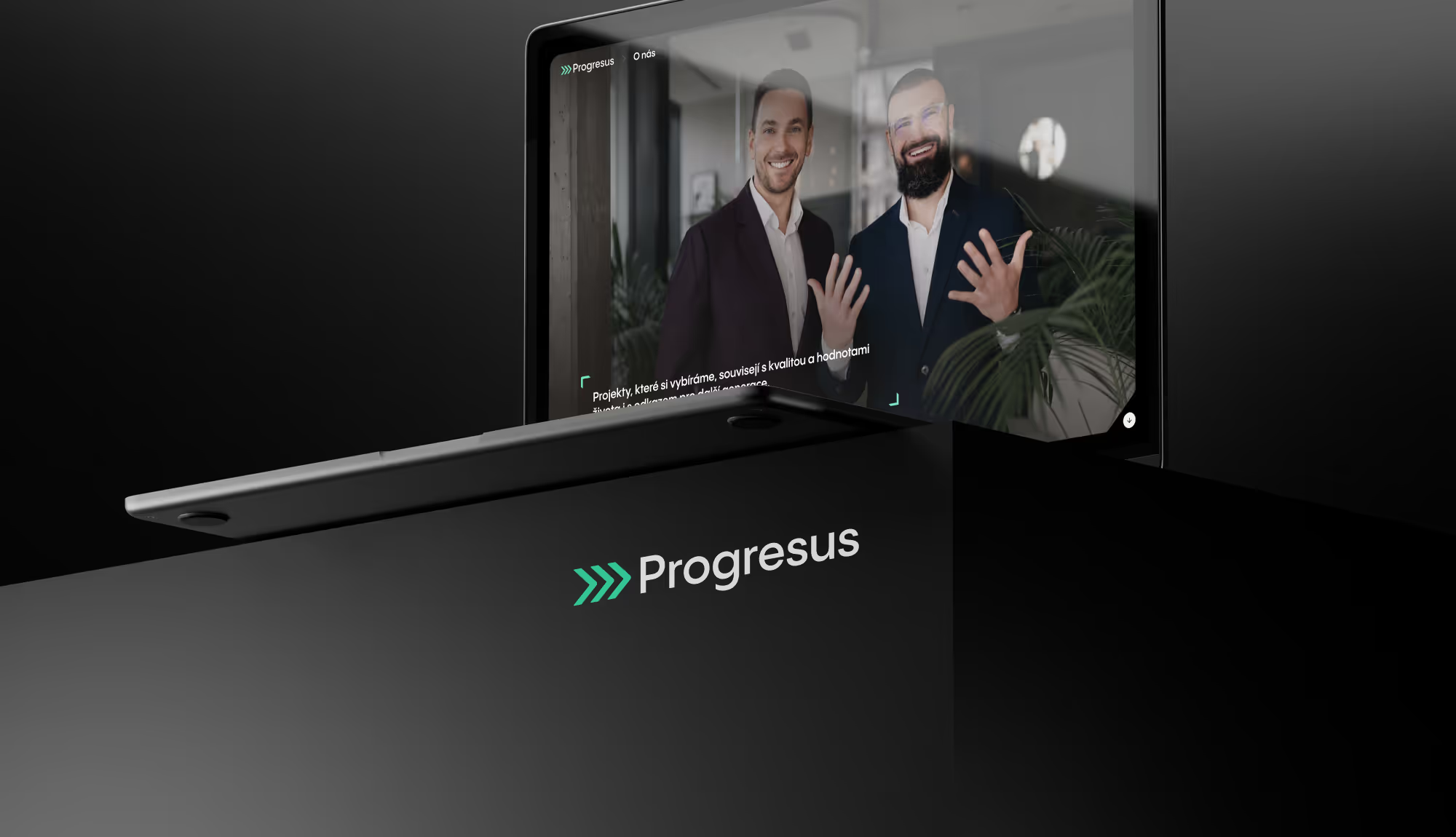
The website’s main goal was to present the Progresus group and all the areas it works in credibly. And in doing so build the credibility of a newly emerging company, so the group would earn the trust of potential investors.
Based on the target audiences, we mapped out the customer journey together with the client and created a site map and wireframes for the website. The client produced the website’s text content.
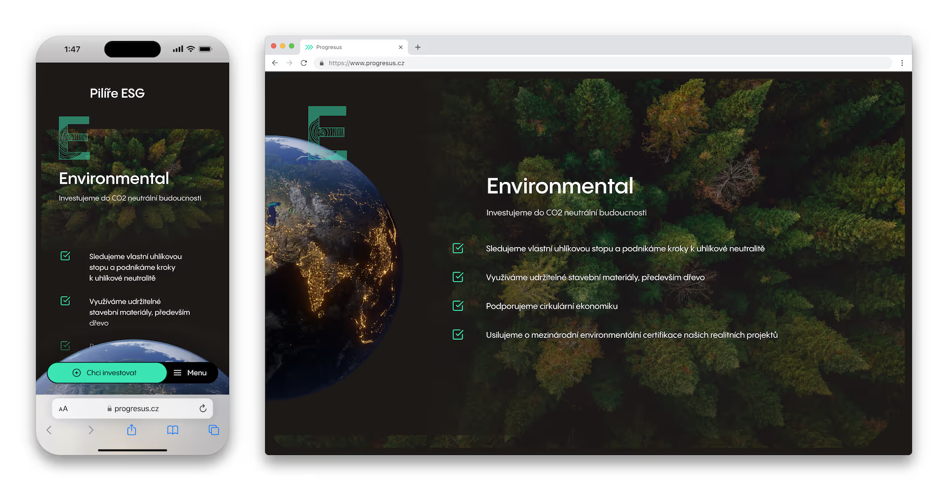
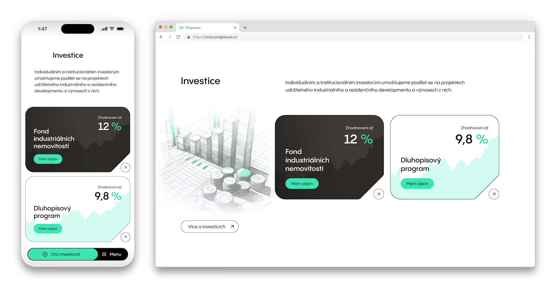
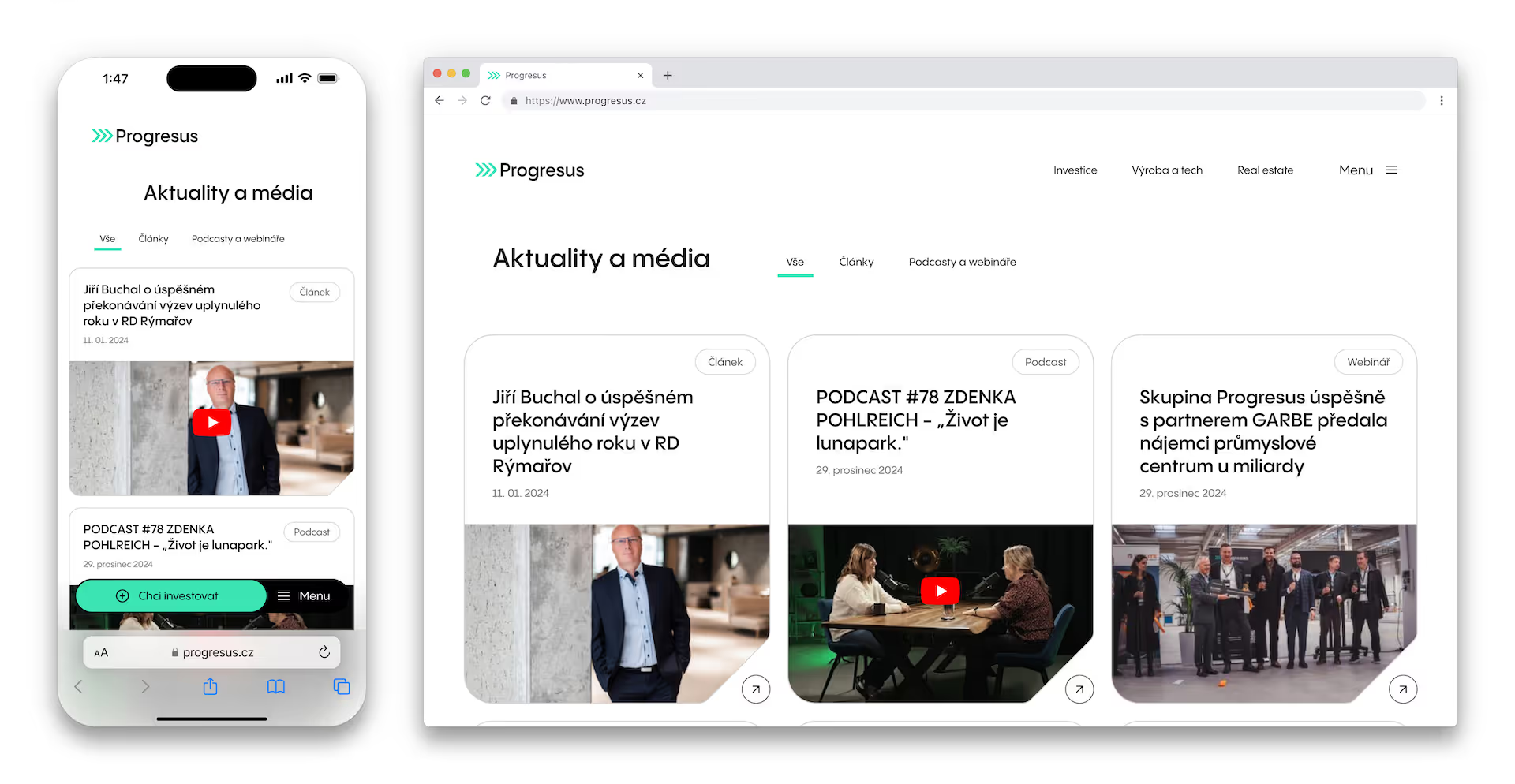
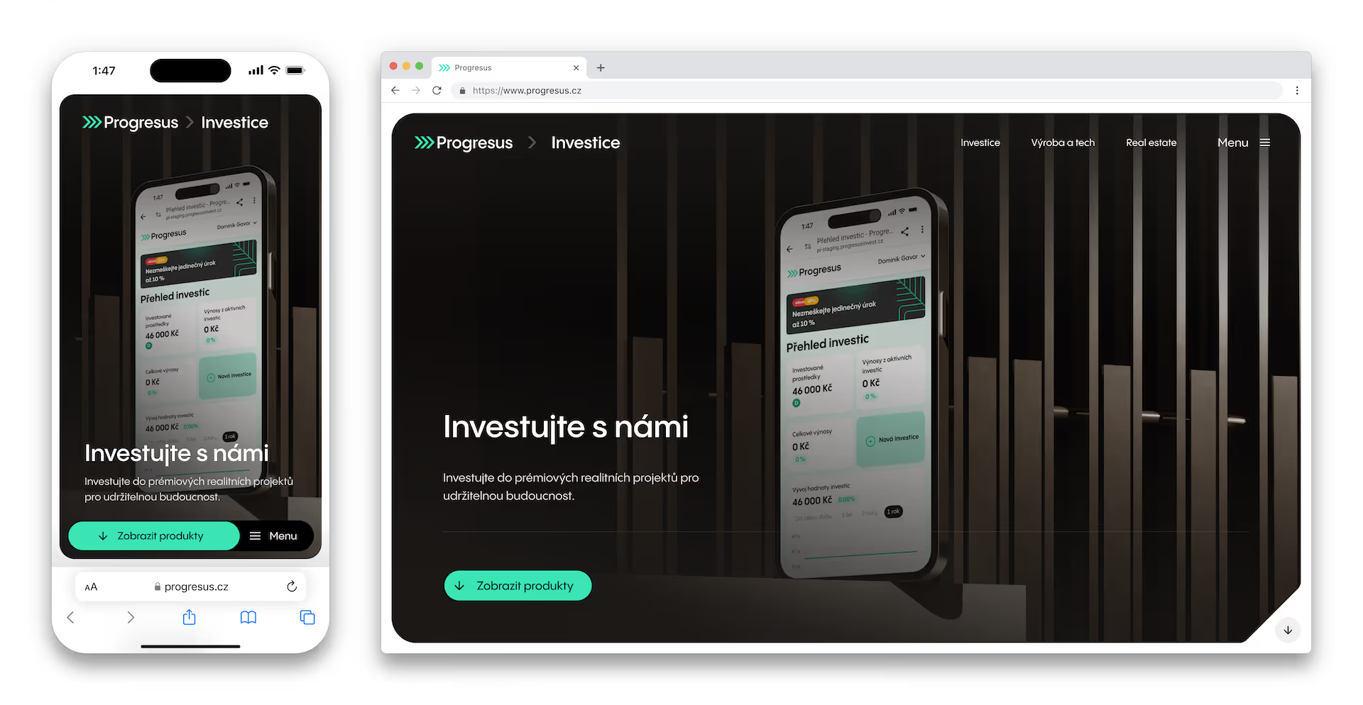
Today 60 to 70% of internet access comes from mobile phones, so we bet on an app-first approach. That means the mobile web uses the elements and patterns of mobile apps. Instead of the classic hamburger menu we created a bottom menu and used interactions like the bottom sheet, meaning overlay elements slide up from the bottom.

Another important step was that our Brand, Product and UI designers jointly created what we call Design Suggestions. That means a proposed solution for every part of the website, worked out even before we start building the site itself.
That way the client knew from the start how we think about the website and could actively consult individual sections and elements with us. They knew the whole genesis of the design, and thanks to that approved almost every following step “on the first try”.
Thanks to Design Suggestions and the collaboration of designers with different specialisms, interesting ideas emerged that quite possibly wouldn’t have otherwise. On top of that, every designer who worked on the website knew exactly when to reach for what. And when we brought someone new on board along the way, we onboarded them into the project far faster. Creating the Design Suggestions also helped us keep a consistent visual line across the whole website.
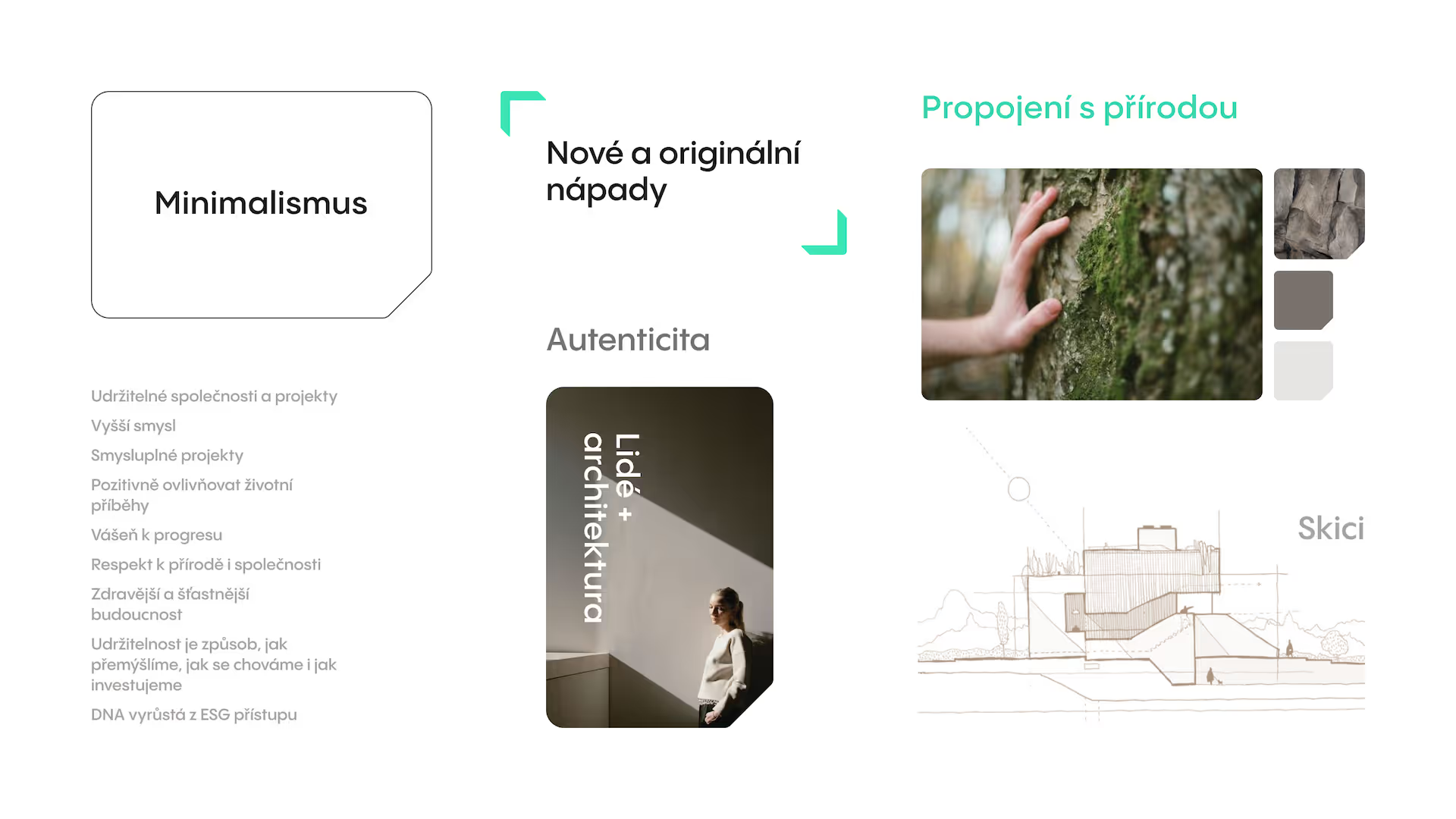
Even though Progresus is an investment company, we wanted it to catch the eye at first glance not only with stability and reliability, but also with youthful, friendly energy. We imprinted these attributes into a minimalist design. We decided to complement bold typography and authentic photography with hand-drawn sketches and graphic elements derived from the arrow symbol in the Progresus logotype.

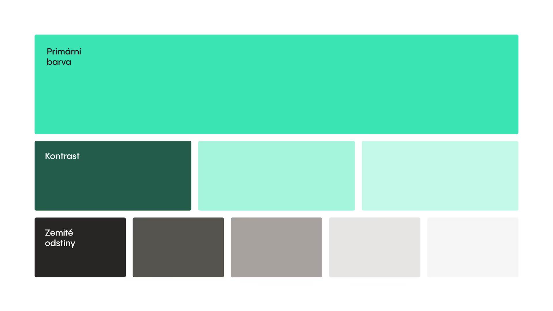
We started from the brand colours defined by the Progresus graphic manual and newly defined a palette of grey shades with an earthy tint. We used them in background surfaces and for small UI elements.

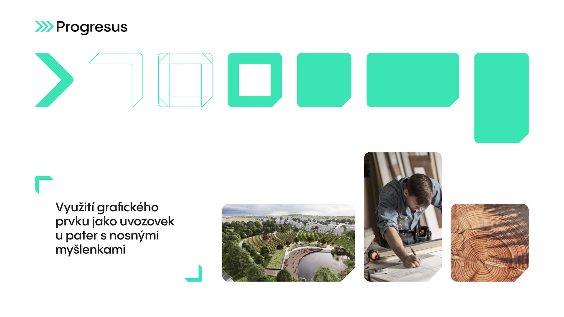
We created various shapes unique to Progresus. One of them comes from combining the Progresus brand element – three arrows. We now use, for example, quotation marks or a frame. This surface can change responsively.
The rounded ends refer to the organic shapes and natural materials the Progresus group’s companies use. Whether in RD Rýmařov, which manufactures and builds timber structures, or Mykilo, which develops materials from fungal mycelium.

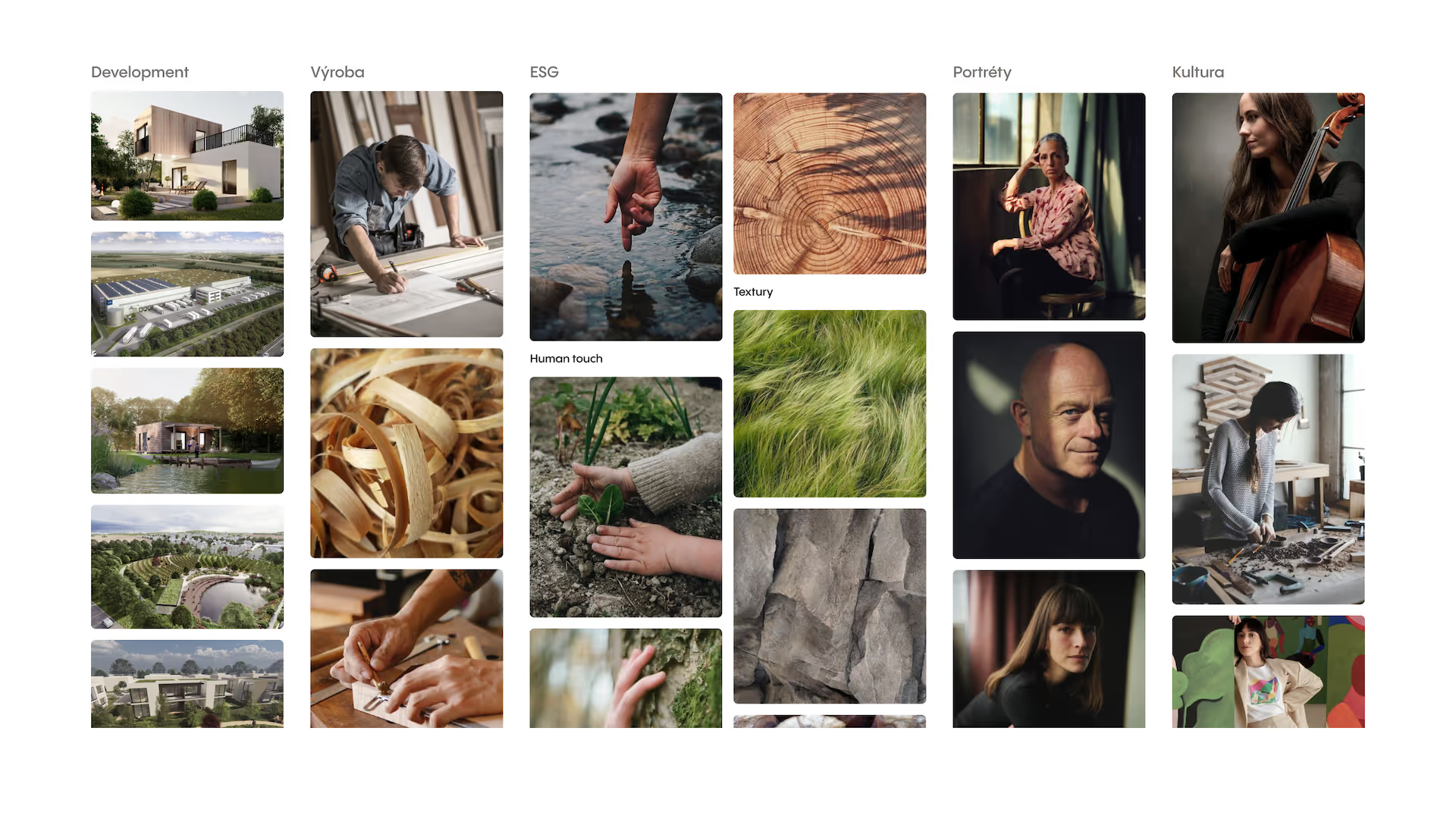
We created guidelines for photographers setting out how to shoot portraits, group photos and people at work.
In portraits we work with depth of field, dynamic natural light and a clean, minimalist setting. To make the photos feel as natural as possible, people don’t always have to look into the lens.
In the real estate and industrial development section we use visualisations and aerial views. In the future we want to show completed projects as much as possible. An important element in how we present individual development projects and their transformations is an interactive slider showing before-and-after photos.
In the division focused on manufacturing, we decided to go the route of close-ups and natural earthy colours, working with depth of field to present craftsmanship as well as possible.

In the section devoted to the ESG approach we work with details, textures, a faceless human element and children symbolising future generations. All of it is complemented by a 3D globe reacting to user interactions.
Elegant animations enrich the website with dynamic interaction and support storytelling. Animated effects that respond to the user’s movement across the page create a sense of dialogue between the website and its visitor. At the same time they help the visitor stay focused.

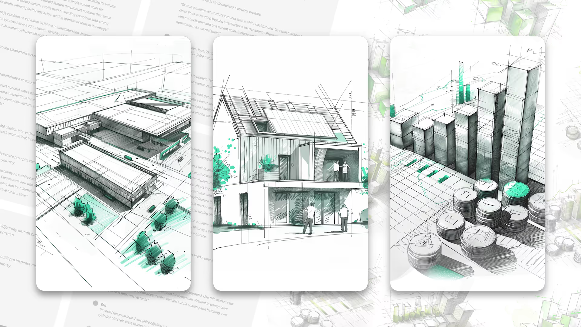
At the start of every project there is an idea, a concept or a sketch. Progresus is constantly creating something new, so we wanted to carry this motif onto the website as a visual accent.
We decided to create the illustrations with AI to save costs, move faster and maintain long-term consistency. How did we do it?


After the visual treatment of the sample pages was approved, we designed all the unique pages, held together by a design system. It works with reusable component tiers and codifies all the colours, fonts, spacing and other elements. This helps keep consistency in the long-term development of the website and at the same time makes it usable for other digital touchpoints.
We built the technical solution on our own dev stack and connected it to selected third-party systems we have long-term experience with.
We prepared the website’s presentation layer entirely in TypeScript on the current version of the Next.js framework. We generate the site statically and revalidate it in the background whenever the data changes. This makes the site fast and “running like clockwork”. The dev stack also helps us achieve good Web Vitals scores. For styling we used the Tailwind CSS framework. The website communicates with the CMS through a GraphQL API, which lets us fetch only the data we actually need at a given moment and so minimises data transfer.

Already in the first phase of the project we chose an editorial system (hereafter CMS) for content management. We picked the headless CMS Strapi, proven by us and pleasant for the client to work with. It gives them the ability to create new content regularly and conveniently, to check everything in advance in the website’s preview mode and to manage the site with multiple users at the same time.
On top of that, the CMS is well prepared for SEO needs. It’s open source, so we can adapt the CMS to the client’s requirements when needed.
We connected the CMS with the tiered design system already mentioned. Thanks to that, the client can assemble further pages and subpages as needed, without a developer’s help. We created a total of forty-three custom sections that can be assembled and combined with one another.
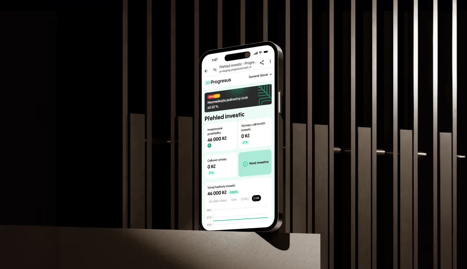
The client can also lock individual pages and set up access to them for users or groups of users. This applies, for example, to the Investor Portal section, where the client sees all their investments and how they’re performing, clearly in one place.
When we tackled storage for media (images and videos), we reached for the proven Cloudinary platform. It lets us work with media efficiently, optimise them, use next-gen image formats and display them in high quality at the smallest possible file size.
As for hosting, we bet on the DigitalOcean platform, which can deliver pages quickly from anywhere. Combined with Next.js, the worldwide Cloudflare CDN and the stale-while-revalidate principle, the pages are quickly available all over the world.
For obtaining consent to the use of cookies we chose Cookiebot. To track statistics we implemented Google Tag Manager and Google Analytics 4. We set up basic metrics and form tracking.
Also worth mentioning is the navigation, where the client can define action buttons that stay visible while scrolling and, on the phone, resemble the dynamic island from iPhones.

Display on larger screens isn’t just a mechanical port of the mobile design. For each type of device we created an individual design with regard to the elements and patterns typically used on it. As a result, the website displays and works correctly on all devices, from small-screen phones through tablets and smaller laptops to large desktop monitors.
For correct rendering across different browsers, at the start of the project we defined all the most-used browsers by device (phone, computer) and operating system (Windows, MacOS, Android, iOS). We tested and optimised the website on them.
We solved the website’s loading speed with a combination of our own dev stack, the Next.js framework, the Cloudflare platform and static page generation.
To make working with the website as easy as possible for the client, we prepared a guide and recommendations on how to process and upload visuals and photos. The client also has a video manual for working with the Strapi CMS.


Once every 14 days — always on a Thursday — we drop a hit of raw thinking for tech founders, CEOs, and CMOs who know that marketing in this segment needs to be done differently. No fluff. No spam. Just the stuff worth reading.