

ZDR is an investment group focused on retail real estate. Its core business is the acquisition, development and management of retail parks.
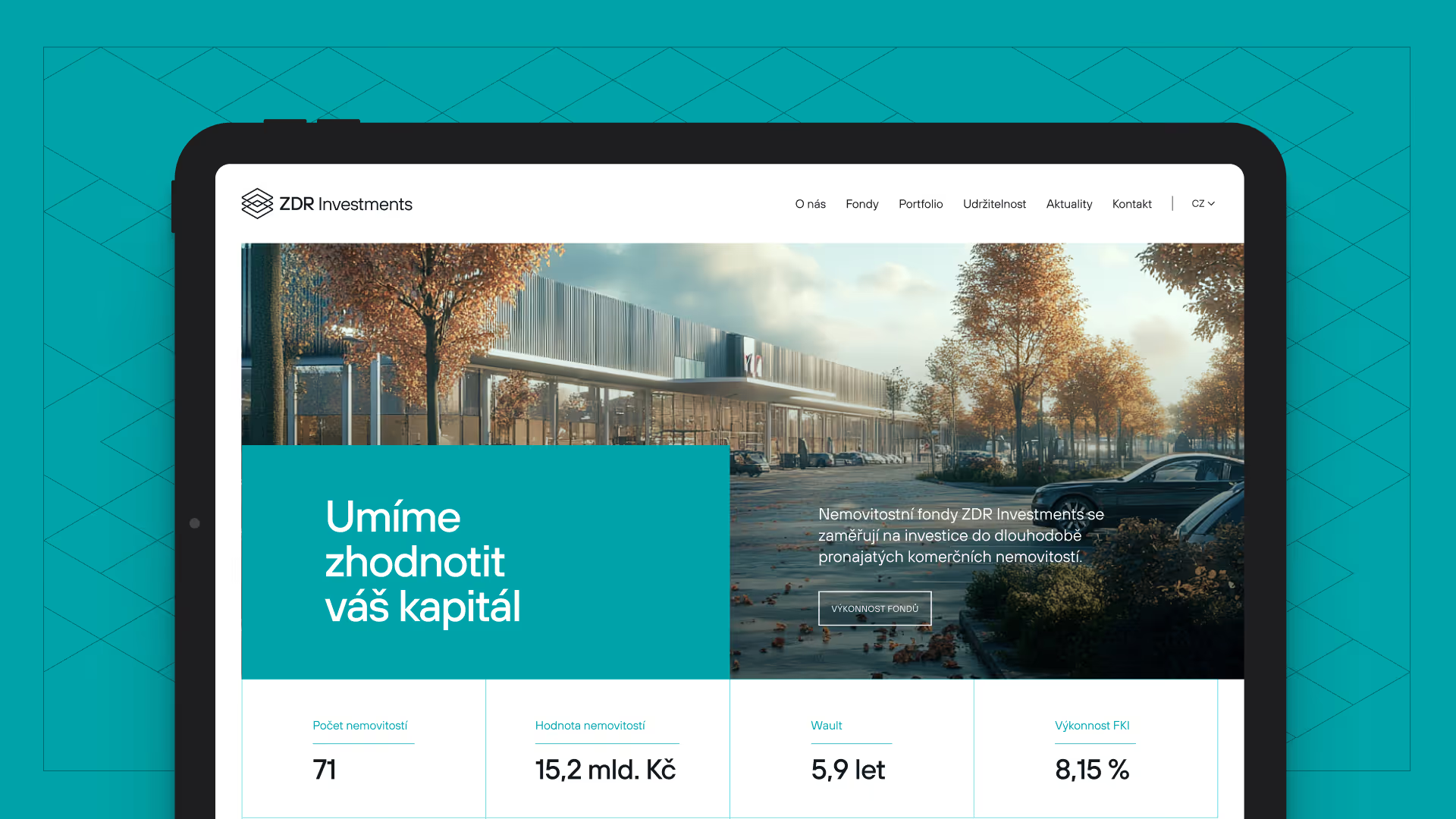
But the brand grew over time and its communication became fragmented. Different parts used different visual elements and a clear brand architecture was missing. On top of that, the main digital touchpoint — the website — couldn’t fully convey the company’s investment character or the strength of its portfolio.
In its first 6 months the new homepage drew 16,969 views — more than in the whole year before launch (7,640). The page stopped being just an entry gate and became a place users return to.
We didn’t want to start from scratch. Why tear down something that stands firm. Our goal was to refine the existing brand, unify its visual language and create a system that scales over the long term alongside a growing investment portfolio.
At the same time we needed to reshape the website so it could:
• Clearly explain ZDR’s investment model.
• Present the real-estate portfolio.
• Feel as precise and systematic as the company’s business.

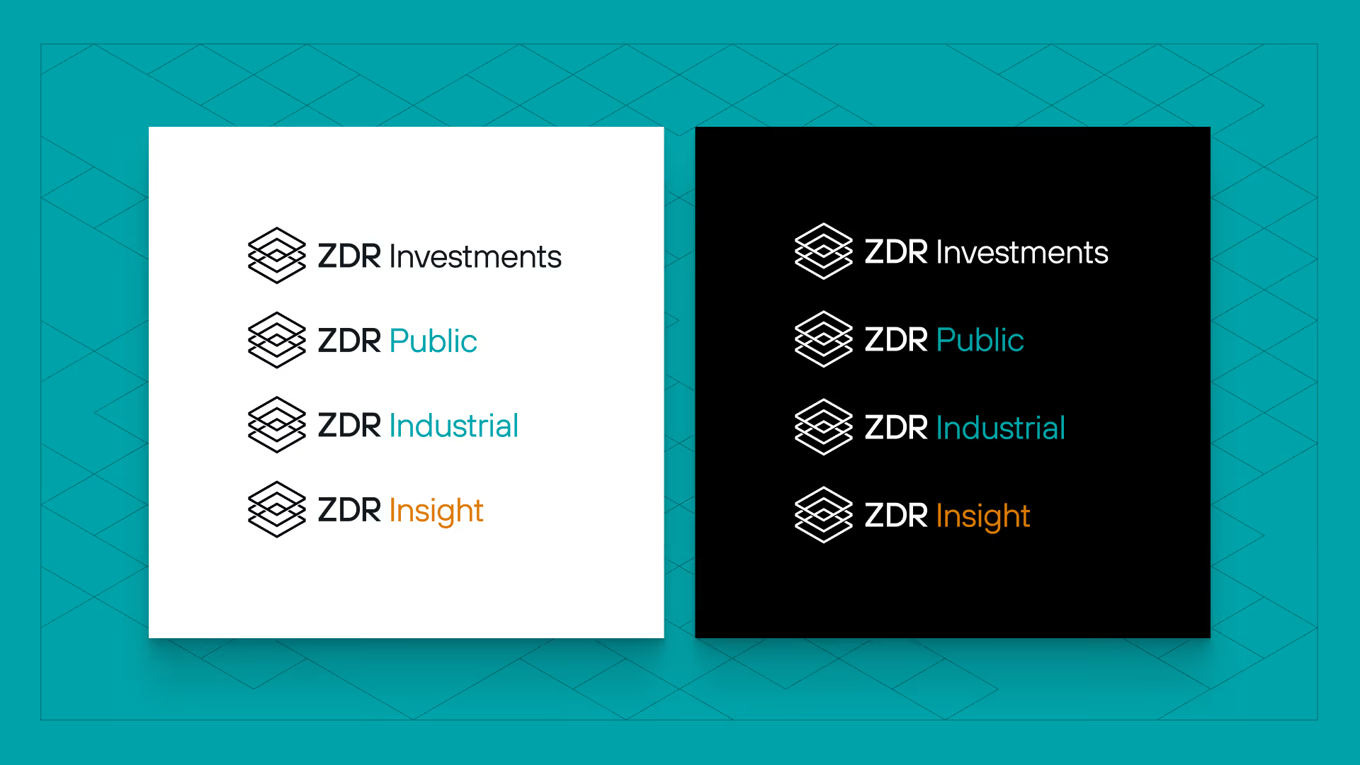
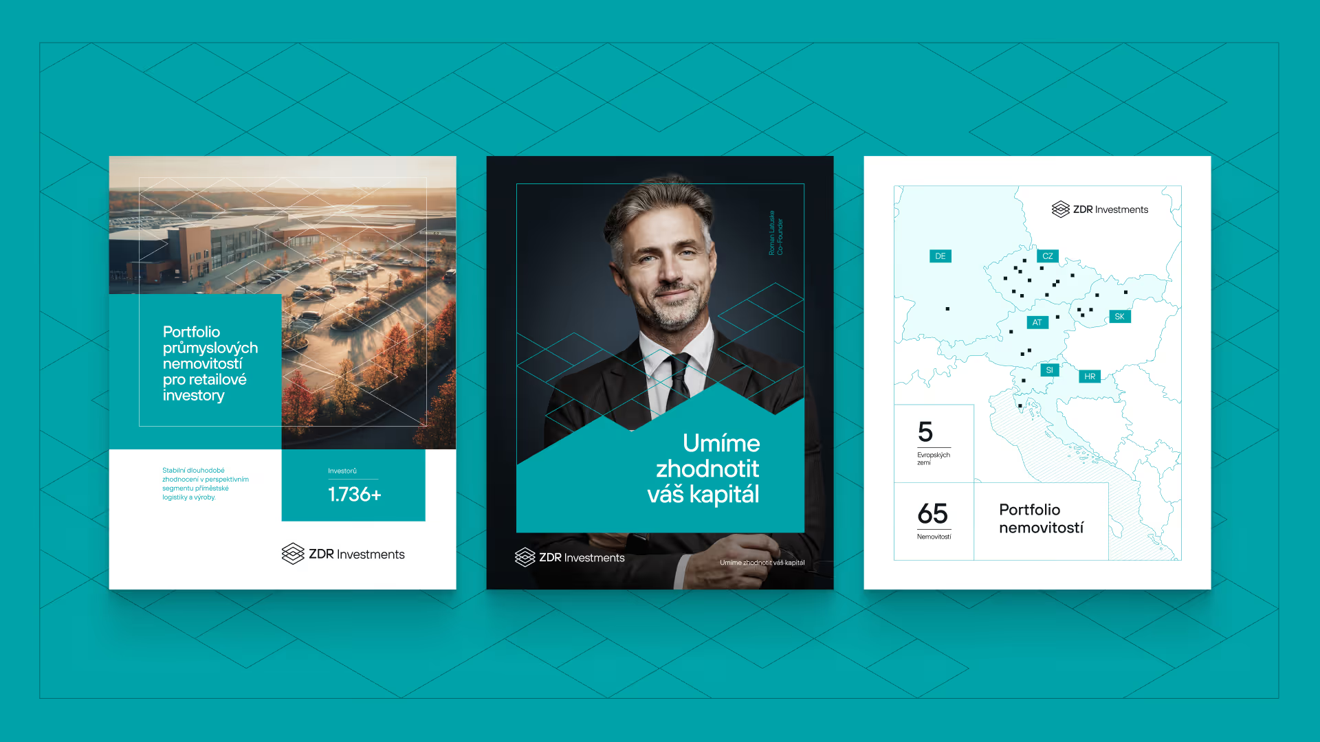
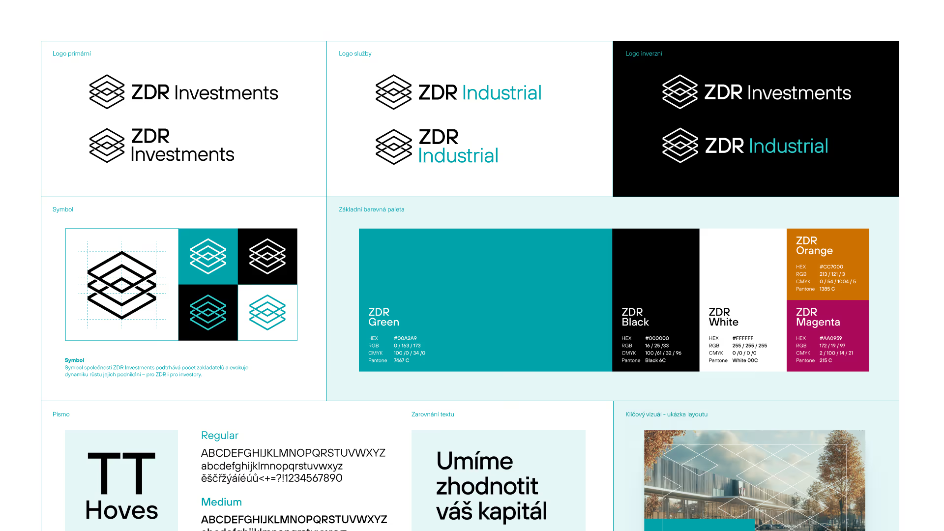
We unified the typography, colours and brand structure and designed an evolution of the existing logo. With subtle tweaks to its proportions and geometry we made it more precise and legible. The key step was creating a new visual principle drawn straight from the essence of ZDR: a property standing on a specific plot of land.
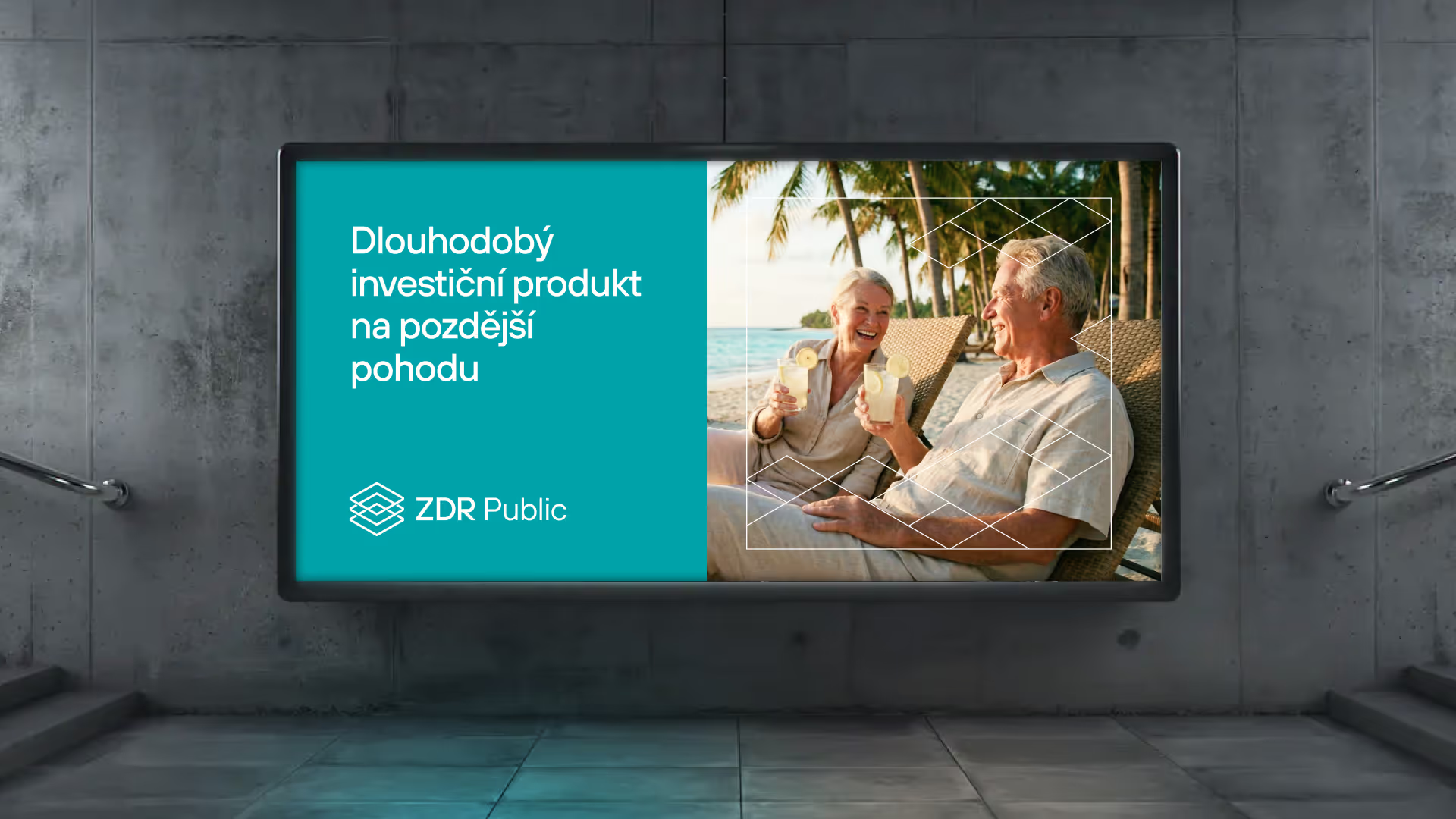
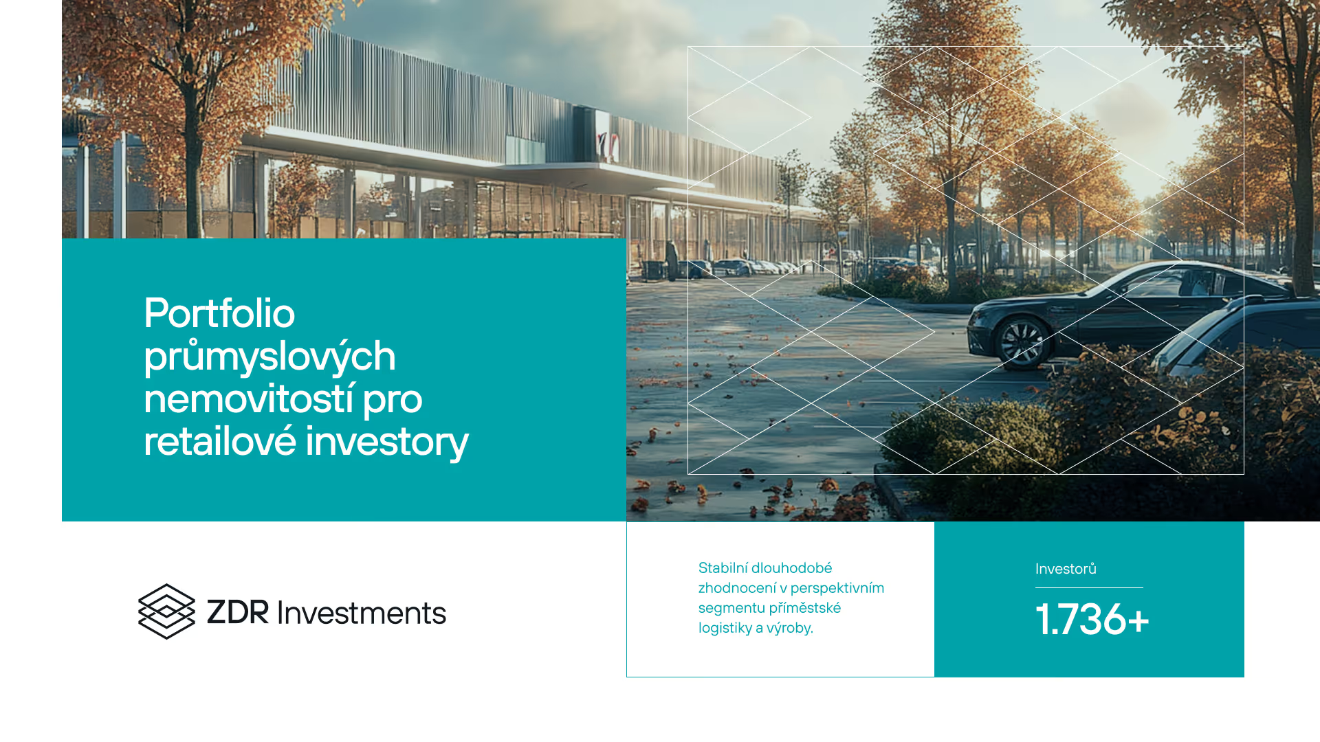
We developed one of the logo’s shapes into an isometric grid inspired by land plots. That is also the basic building block of retail parks. This modular system became the graphic language of the whole brand.

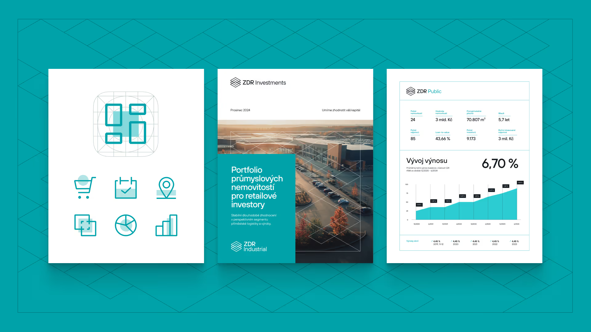
The grid can be tiled infinitely, scaled or combined with photography. The result is a flexible visual system that works across presentations, physical materials and digital environments.

Speaking of materials — instead of a hefty manual we designed a brand sheet. ZDR isn’t a corporation with dozens of departments, so we chose a compact solution. The main advantage of a brand sheet? It’s a simple, clear document that can hang on the marketing team’s wall — and that’s enough.

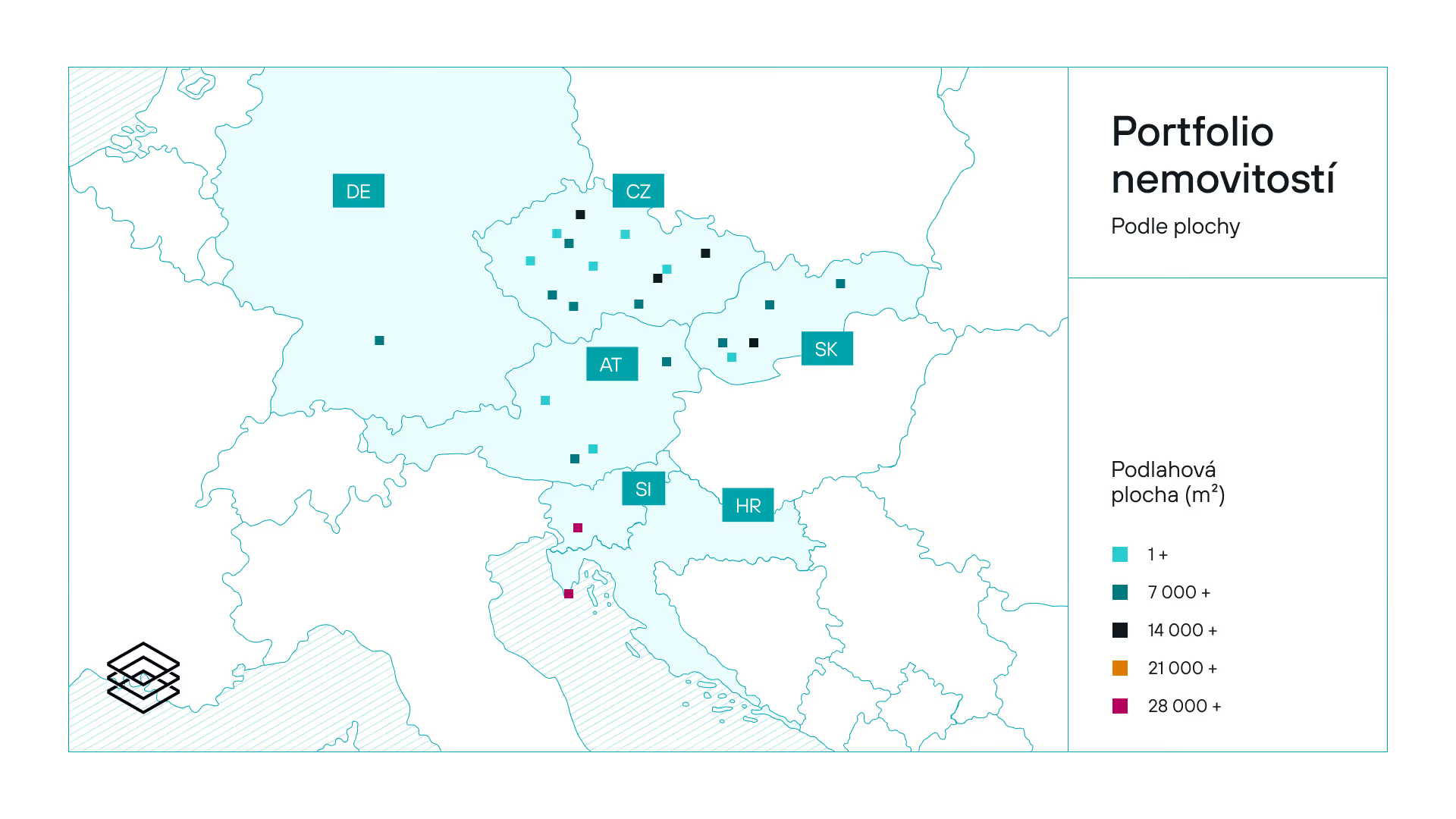
The website is the project’s key deliverable. We designed a modular layout inspired by architectural drawings. We defined what comes naturally to the brand: working with data, charts and investment blueprints. We created a system of blocks and cards to present the portfolio. The site thus naturally connects the brand’s design, data and investment logic.


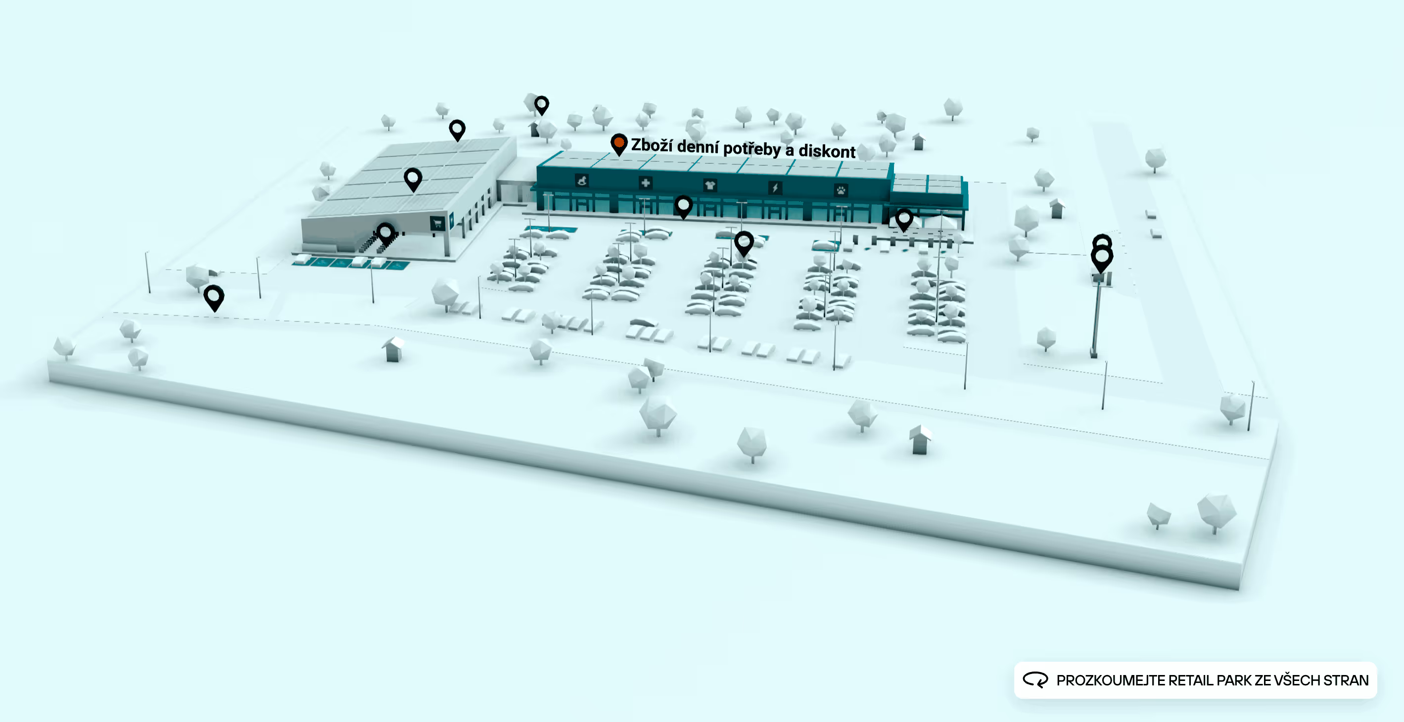
The words 'retail park' are abstract to most people. So we chose a detailed graphic treatment that shows them the building and the shops they’ll usually find there. On the homepage we built a 3D model of a retail park — users can rotate it and click on hints. Doing so highlights that part and reveals a caption.

Alongside the Czech and English versions, a lightly adapted version for the Singapore market is already live. A simple website can be scaled quickly. And confirmation of its success came from the client themselves. The website really proves its worth in day-to-day use:
"The new website is now quite self-explanatory and guides you through the whole process. Colleagues often use it in investment-advisor training instead of slide decks, and it has worked really well for them."

The new visual system gives the brand a clear structure and, at the same time, the flexibility for further products, communication and media outputs. The website works as the main place where everything happens — the brand can clearly present its investment model and the value of retail real estate.
The result is a brand that feels precise, systematic and confident. Just like the business it represents.


Once every 14 days — always on a Thursday — we drop a hit of raw thinking for tech founders, CEOs, and CMOs who know that marketing in this segment needs to be done differently. No fluff. No spam. Just the stuff worth reading.